


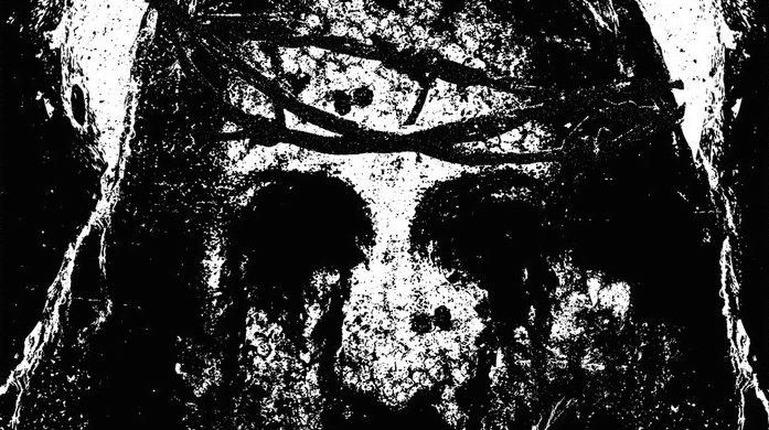


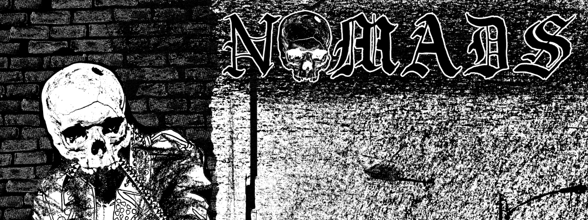


As we go about our lives, we are constantly surrounded by images of all kinds. During the 90’s, when I would pass newsstands one magazine always caught my eye, and that was RAY GUN. What attracted me to this publication was it’s crazy fucking covers that were full of chaotic typography. The first art director for RAY GUN, David Carson, changed the game when it came to graphic design because he ignored all of the rules and made his own. His art became an extension of the artist he was featuring, and would go far beyond what would be consider normal. The impact of RAY GUN is still all around us today and you might not even realize it. Check out this massive collection of iconic RAY GUN covers and layouts…We salute you Robert, thanx for the inspiration.


Kate Blackthorne
May 7, 2014 at 7:41 am
They briefly discuss the significance of this (and the birth of “grunge fonts”, IIRC) in the film ‘Helvetica’. I totally remember how eye catching and strange their covers seemed back in the early-mid 90s!
Kate Blackthorne
May 7, 2014 at 7:41 am
They briefly discuss the significance of this (and the birth of “grunge fonts”, IIRC) in the film ‘Helvetica’. I totally remember how eye catching and strange their covers seemed back in the early-mid 90s!