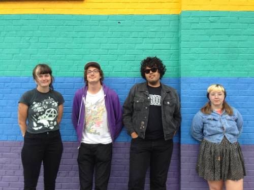


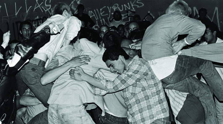


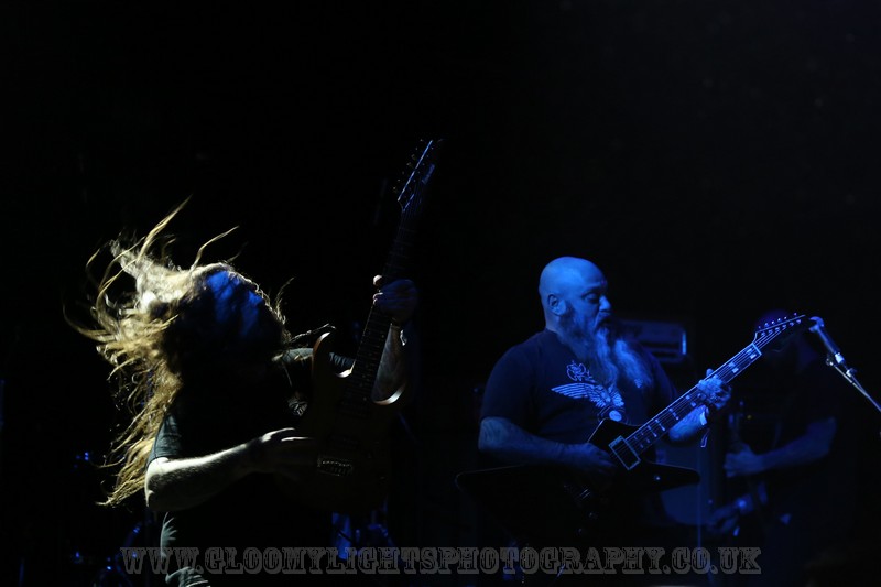


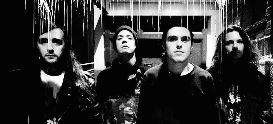


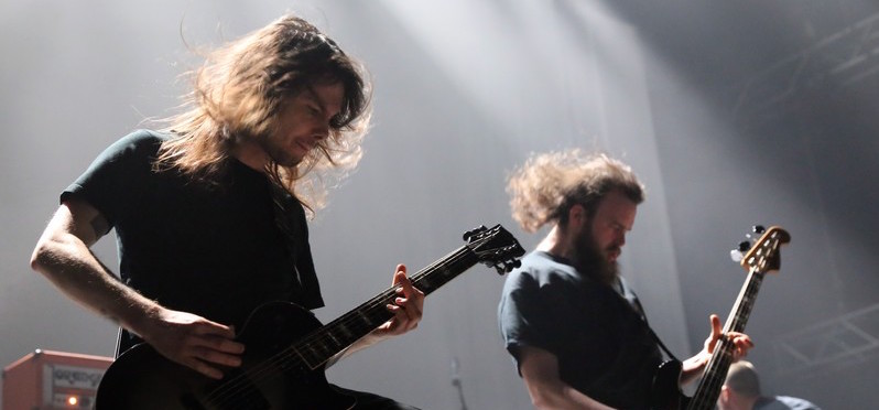


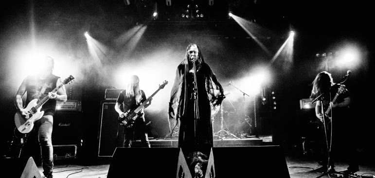


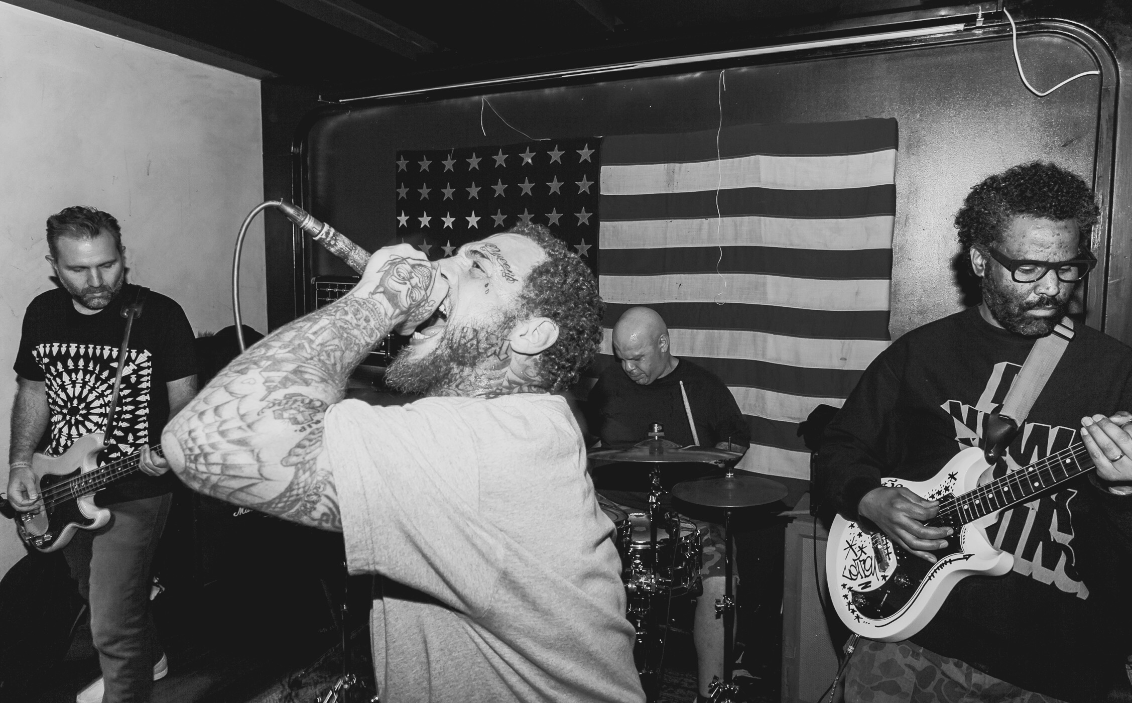
Bone Dance is a chaotic “metal” band from Boise, Idaho, that my band Old Wounds toured with the last time they came out East. During that time, I became extremely friendly with the dudes in the band, but specifically hit it off with the band’s bassist, Bryce Kresge, over a shared admiration for graphic design. After we had finished the tour, I continued to keep in touch with him about his work and the steamrolling force of Bone Dance. Here’s what he had to say…
Q: Over the past couple of years, Bone Dance has been your main creative outlet, both musically and artistically. Have you always been in Bone Dance? Have you always been the mastermind behind the visuals for them?
A: Short answer to always being in the band is basically, yes. Longer answer is that the band formed about 7 months before I had joined, and they had a different bass player who’d decided he didn’t really want to be in a heavy band after the first few shows they had played. I tried out on a lark and was asked to join a couple hours later. And yes, I’ve always been the guy behind the aesthetic, save for a couple t- shirt designs we’ve had friends draw up for us. I wouldn’t call it being a mastermind though, things just kinda fall together, ideas happen randomly, and I just organize them into something tangible.

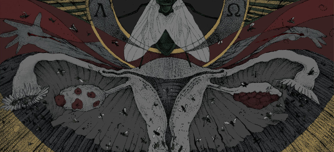
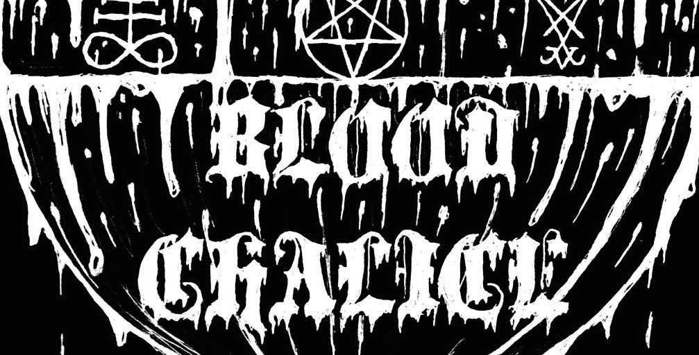
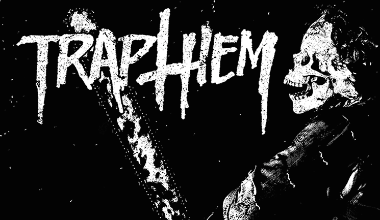
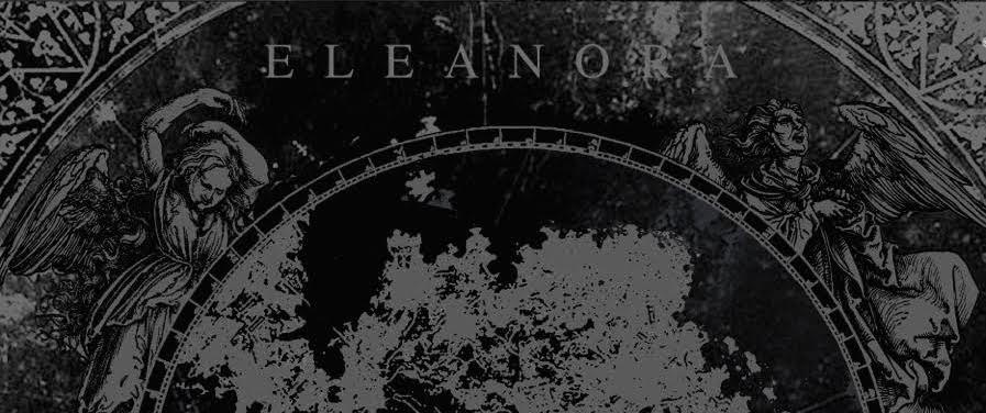
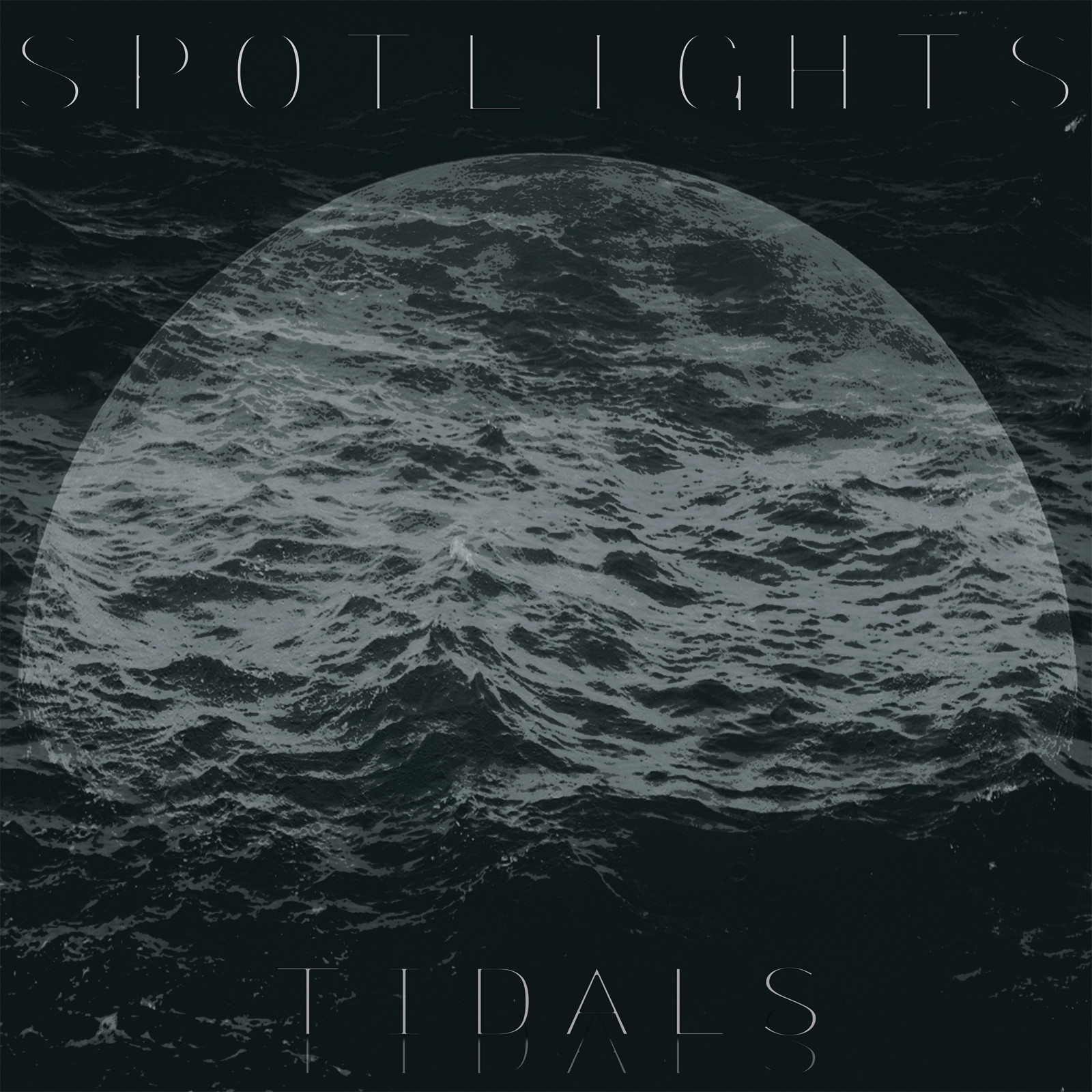
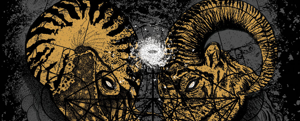
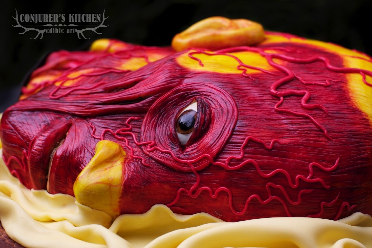
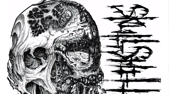
Q: The Snakecharmers repress that Melotov Records just put out for you guys is so damn cool. Care to shed any light on how the artwork for that came together? Everything from the bizarre vinyl colors (Green with a Grey Smoke, and Gold) to the iconic cover and insert is spot on.
A: The artwork for this repress is an amalgamation of the initial release (self-released screenprinted CD sleeves), the initial vinyl release (Protoype Records), and the limited cassette tape release (Sick Machine tapes), and everything that I wanted to include in those releases but couldn’t due to the restraints of the screenprinted medium, and budgetary considerations. Melotov was cool enough to let me go a little further with this release.
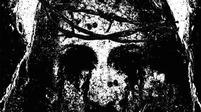
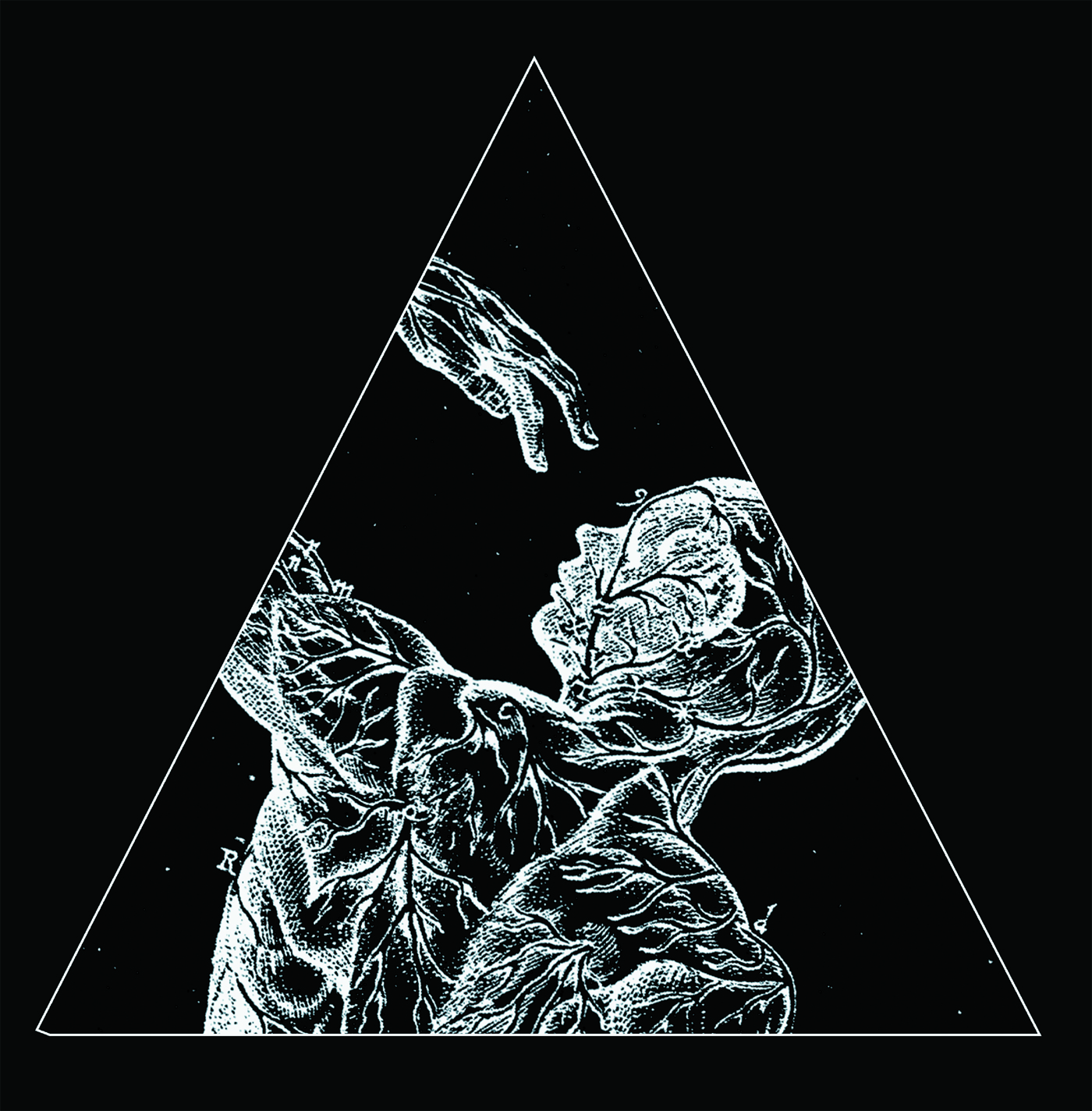
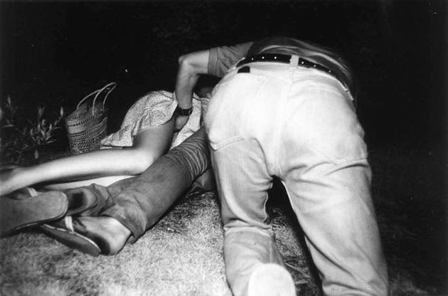
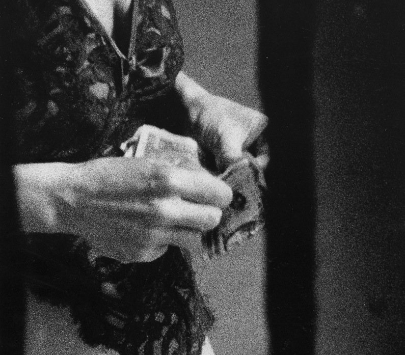
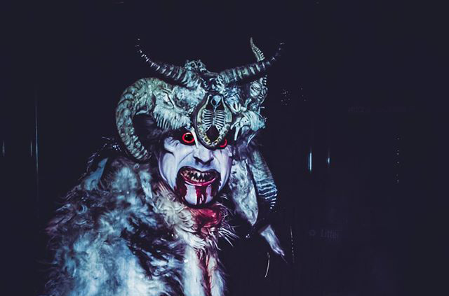
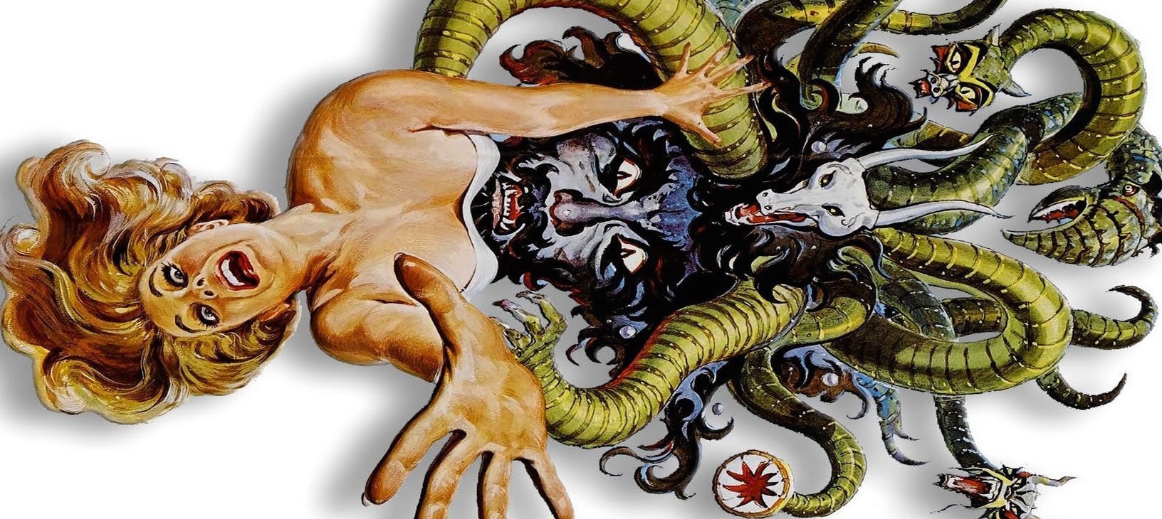
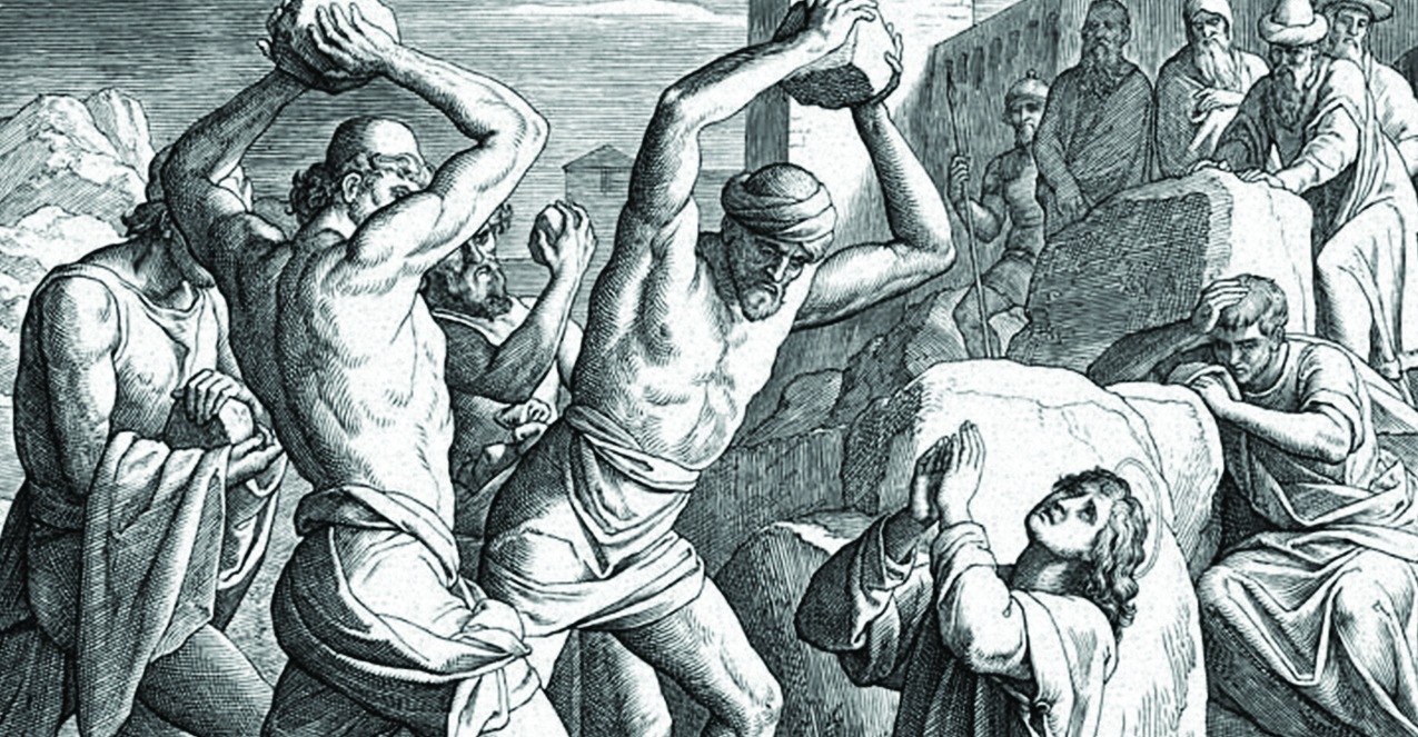
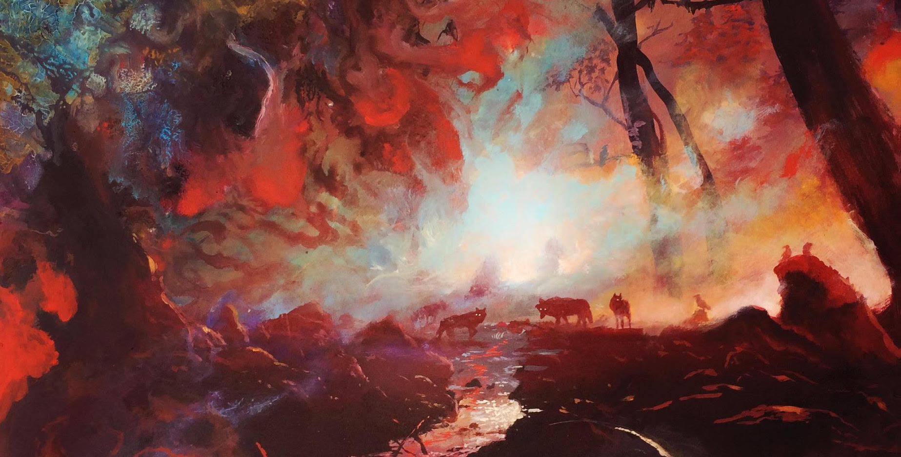
I never felt that the artistic concept fully came across in the initial releases because of those limitations. The initial screenprinted release artwork relied heavily on snake handling practices of certain sects of Pentecostal churches in the Appalachian mountains, partially because that imagery translated to the medium the best, making it easiest to reproduce via serigraph printing. The more I absorbed myself in that imagery, I began to make more and more connections, started to think about what a “snakecharmer” is. It’s not necessarily an Indian with a flute and basket. I wanted to explore the idea of the hunted being something that controls a hunter. Victims are necessary. I was focused on the mongoose/cobra relationship for a long time, and initially the vinyl release of the EP featured that concept prominently, but was ditched because the artwork was too illustrative and didn’t really fit the aesthetic of the band. I found much more interest in snake milking, rats and cults. The leader of a cult is nothing without his followers, a rat ensures a snake can continue living, venom is needed to be able to counteract a snakebite, etc. Herpetologists who milk the venom can control these dangerous animals in a way that I find fascinating.
That necessity of victimhood is a relationship that intrigues me. Some call it the circle of life, but that’s a too utopian; it doesn’t reflect reality.

Q: Do you also handle all of the layout work for the Bone Dance releases? Even the text has a very unique layout.
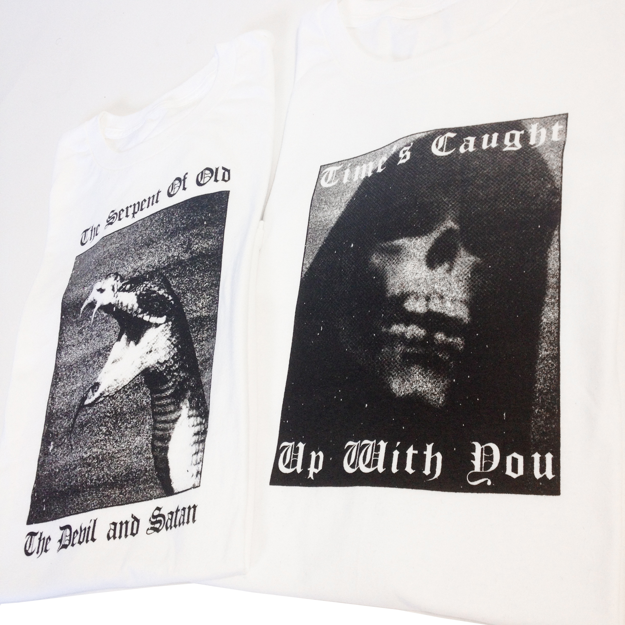
A: Yes, I do all the layouts. And thank you. I think that uniqueness comes from necessity – I have to make the text legible, and I feel the text is 50% of what makes the design work. I look at typography as an artistic element; shape, space, line, form; type can be used in a way that it can fill the shoes of any of those design elements.

Q: Does being from Boise, ID have any inspiration on your artwork? Aside from the downtown area, I can’t see there being too much culture. Based on what you guys have told me, and from reading the lyrics I can tell Boise is a very ugly place when it comes to drugs, and the people who can inhabit that area.
A: Interesting question. Culturally, our hometown is a little of both – it’s close to being metropolitan, but not quite removed from the shitkicker hick kinda stuff either. And a lot of those areas are being taken over by suburban sprawl now. I’m not quite sure which is worse. I think half of what you’re reading and taking away comes from having a negative outlook. To the north of the city, it’s actually very mountainous and beautiful. Lots of steep river valleys and secluded lakes. Look at the cover of Botch’s “Anthology of Dead Ends” – that’s an image of the Sawtooth mountains, about 2 hours north of Boise. That’s a bunch of beautiful bullshit. So we sit kinda right on the edge of something that’s breathtaking and gorgeous, and something desolate and ugly. The enormity of both of things can’t be ignored.
I find that I like open area / negative space in design. To the south of the city, there is a lot of that. It’s not like being in a bigger city. Looking at things from eye level here, in almost any direction, the sky takes up a good 40% of your visual area. That, and jarring juxtaposition (desert vs mountain, cosmopolitan vs rural) are something I can see relating to my design work, though it’s something I never really thought about before either, I guess it’s just been an automatic response.

Q: When you begin working on art for Bone Dance, do you collaborate with whomever is writing the lyrics, or do you create the imagery first and go off of that?
A: It’s mainly a response to what the musical product is. It’s not really collaborative in the sense that I’m trying to influence the lyrical content or anything like that. And I don’t feel that the imagery is really a forethought either. It’s more like a response, really. If I’m making something like a merch design, that just comes from trying to work with imagery that matches an already existing aesthetic that has evolved over time. Sometimes I’ll have a few different ideas I make roughs of, and then see which one feels right for the project, but it’s mainly my reaction to what we’ve made musically, and to an extent, what I feel when playing it.
For our last full length record, I really sat down and thought about all the lyrics for all the songs, and looked for a unifying theme amongst all of them. It struck me as all the songs had to do with being a product of your environment, so I went with what was most immediate – our surroundings. My good friend Alex Hecht (ahechtphoto.com) is a photographer who has a unique eye for his surroundings, and has spent a lot of time photographing the city and it’s surrounding areas in a way I felt was very complimentary to what I like to do with design, especially in regards to open areas / negative space. So we collaborated on the imagery – there was a much larger concept I wanted to go for, but again, due to budgetary restrictions, we had to scale that back and go with simplicity. So we made the full artwork available as a pdf booklet when you purchased a digital download of the record.
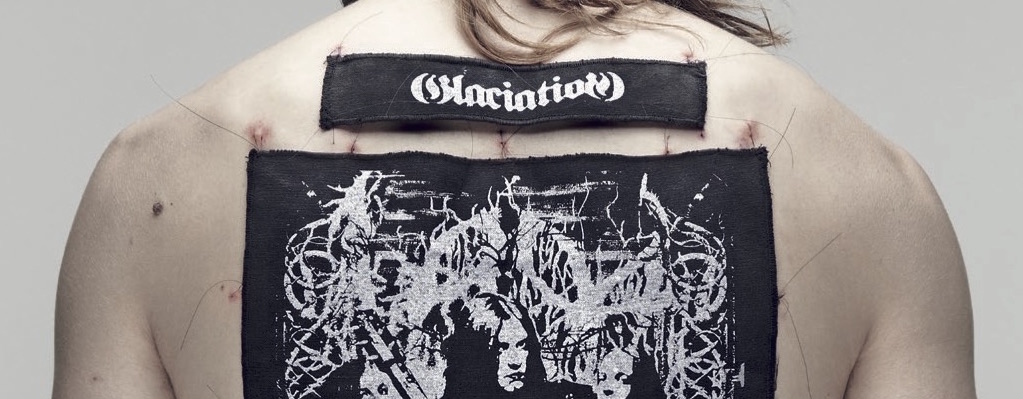
Whenever I work with another band on their record layout, or even for a t-shirt design, I try to absorb what they’re all about – I request access to the recorded material and the lyrics, get a feel for what they’re all about, and try to translate that visually, but still make it feel like my own. Sometimes we talk it through, sometimes I’m left to my own devices, but I always try to make things relate to the music – visuals, I feel, should be a complimentary extension of the music.

Q: Who would you say your biggest influences are when it comes to design?
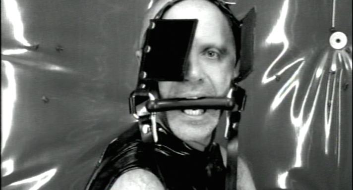
A: I’m fucking terrible with names. I like Swiss design a lot. I know that’s stereotypical and gonna get an eye-roll, but I like the obsessiveness of it. Clean, sharp, precise, meticulously and refined. OCD traits, really. But at the same time I really like the Japanese aesthetic as well, especially the concept of Wabi-Sabi, which is basically the idea that things are transient and imperfect, and you should let them be that way, that beauty is in the unpredictable details. I guess that comes back to juxtaposing different elements. I like that kind of dissonance. I’ve always liked the design used in Adbusters magazine – I could say that’s been influence for sure – when I’m feeling uninspired I’ll flip through my copy of Design Anarchy and I usually find myself fired up again. That’s probably my biggest influence – hijacking clean, comfortable corporate design and making it imperfect and ugly. It’s very jarring and attention grabbing. Whoever did the artwork for Radiohead’s ‘OK Computer’ was a big inspiration – that was the first album I remember listening to and really seeing a connection between the music and the artwork. That album design perfectly captures the tone of that record. Oh, and who the fuck does the artwork for Iron Lung? That shit kills, every record looks incredible.
Ugiyo-e style printmaking from Japan, late Renaissance style painting and people who are taking those things and modernizing them, like Takato Yamamoto and Nicola Samori are currently my favorites. Others include Aaron Turner, Tsukioka Yoshitoshi, Romain Barbot, Katsushika Hokusai, Joel-Peter Witkin, Rene Magritte, Rembrandt; Horiyoshii III, Thomas Hooper and a shitload of other tattoo artists, both in Japanese and American traditional styles. The Russian style of prison tattoo is also incredible to me. I’m forgetting a lot, but like I said, I’m terrible with names.

Q: I feel like the beauty of music is that art and design relate so well to it, so it’s very easy to link the two together in a meaningful way. Were you into art and design before you got into metal and hardcore, or was it the other way around?
A: I wholeheartedly agree. I drew a lot when I was a young kid – never thought I was all that great at it though – learning to play guitar quickly took over learning how to improve my art skills.
I think I pretty much took the typical path – once I got into music, I devoured it all and would pore over the album artwork for the duration of the album, reading along with the lyrics and absorbing everything else during instrumental sections. I definitely got into design later on – around my junior or senior year of high school, and began teaching myself most of what I know now, which I’d still say isn’t a lot, but learning is a process that shouldn’t stop. I’d enrolled at Art Institute of Seattle for graphic design out of high school, but never finished there, for myriad reasons. (As an aside, my greatest show regret ever, happened when I moved there and found out about a Queens of the Stone Age / Dillinger Escape Plan show happening the day after I’d gotten moved in, but tickets were already sold out. Fucking sucks too – Queens were touring on Songs for the Deaf, and Irony is a Dead Scene had just come out. Gonna take that regret to my grave.) I attempted to continue my education here in Boise, but music got in the way (again), and I dropped out.

Q: What does a typical playlist look like when you’re working on designs?
A: I usually listen to new records that I’ve gotten while working. But I find that I end up getting absorbed in what I’m doing, and then it’s time to flip the record over, and I don’t do it. So half the time it’s silence, and me grumbling a lot. But when music is on, it varies. If it’s something I need to really concentrate on, it’ll be something more relaxed and less abrasive. Earth, Radiohead, Pygmy Lush, Bohren & der Club of Gore – lots of Clams best online casino sites instrumental mixtapes lately, too. Or a band that I’m so familiar with that it doesn’t distract me – early Queens of the Stone Age is a favorite; I know those records like the back of my hand.

Q: Any bands, past or present, that you’d love to design for?
A: I would have loved to do a record for Curl Up and Die – they had a really cool way of having their artwork, visually, be the exact opposite of their sound, but conceptually it would still work directly with their lyrical themes – I think that’d be a fun challenge. Neurosis would be a great band to work for too, I think. I’ve always really dug the band Crowpath but thought the design work for their last two records could have been better – would’ve liked to try my hand at that. Really though, right now I’d just like to take on almost anything.
Q: Bone Dance plays a style of music that unfortunately is the black sheep in a world full of cloned white sheep. When bands like Botch, Curl Up and Die, Coalesce, Rorschach, all broke up that style of chaotic and dissonant “metal” sort of died. Why do you think that this style has phased out, and what is it about this style that draws you and the rest of Bone Dance to continue to push this “extinct” style?
A: I don’t feel that it’s extinct at all. Converge, KEN mode, Capsule, Gaza (even though they’ve broken up), are all bigger bands that still play that angular, aggressive music – the thing is though, it’s just not as hyped as it used to be. I think people look back on that time period with rose-colored glasses. I mean, even in their heyday, how popular were Coalesce, Rorschach, or Deadguy? Seems to me like they had that ironic “get popular after you break up” type thing happen to ’em. Paintings really are more valuable when the artist is dead, I suppose.
So to me, the thing about it “phasing out” is this: When it was more popular in the early 2000’s, just like any style that gets popular, it was being aped by a shitload of unoriginal, talentless hack bands. It’s not a very easy style of music to play and make memorable songs with. So you had a plague of shitty ripoff acts, weirding out audiences and confusing them. That burns people out and pushes them away. (Seems like that’s happening right now with 2nd wave screamo, or whatever you wanna call it, too. There’s a lot of baaaaad bands out there right now wearing their emotions on their sleeve and being so “honest” that it makes you feel second-hand embarrassment. It’s gonna happen to that shit too. It’s a cycle.) But on the other end of things, as it was getting more popular and the good bands were being noticed, you had a version of it being taken to its logical extreme; you ended up with a bunch of tech bands like Into the Moat and Psyopus, and spaz-core bands like The Sawtooth Grin and The Great Redneck Hope who, to me, were craziness for its own sake. I think that combination of untalented bands trying to play challenging music, and other bands getting so technical that it confused the listener, led to it “phasing out”. I have to disagree with the assessment that it’s extinct though. It’s found it’s niche now. Lots of people still adore the Hydrahead back catalogue. There still a lot of bands around now playing this. Just not really putting themselves out there. Which is a shame, I think.
Playing what we play was never a conscious decision. It just evolved that way. Our early material was much more simplistic. Hints here and there, but things just naturally changed to what they are now. Standard answer, really. We’ve just played what we wanted to hear, and put songs together in a way that makes sense to us. We’ve pushed it simply because we believe in what we do.

Q: Do you ever think it’ll make a return and hold the same weight that it once held?
A: People were asking that about tuff-guy hardcore years ago, and look at it now.

Q: Musically or artistically, any projects in the works that you wanna spill the beans about?
I’ll be doing the layout for Cult Leader’s new record, the details of which will be getting announced sometime soon. I’m actually looking for more projects to take on, as up until recently I’ve just been way too busy to do anything but what’s been necessary. So hit me up!

Q: Thanks for taking the time to do this, that’s all I have for ya. Any shoutouts you want to make?
A: Nah, I think namedropping sucks. Thanks Brandon! xoxo

New Comments