In April 2011, Steve Ignorant’s “Last Supper” tour received a contentious welcome in San Francisco. Ignorant fronted the seminal English anarcho-punk band Crass until their disbandment in 1984, but decided to tour the group’s early material once more in 2011.
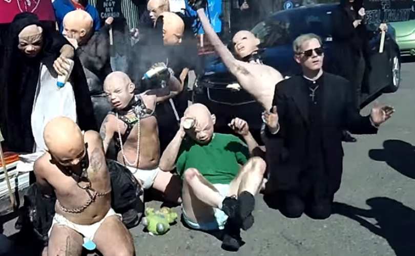
With no original members but himself, the decision pitted fans vehemently against each other. On one hand, the San Francisco date sold out. On the other, a cadre of indignant detractors in the city organized an opposing show nearby and protested what they perceived as Ignorant’s calculated scheming and exploitation of Crass’ identity. They stationed a school bus outside the concert venue Slim’s and encouraged attendees to defect and attend a guerrilla show organized down the street. In an age of music squabbles annexed to the Internet, the street-level tactics were refreshing, bold, and resembled the clever subversive activities Crass itself engaged in during the late-70s and early-80s.
Upon formation in 1977, Crass vowed to break up in 1984 as a nod to the Orwellian totalitarianism it likened to England under Prime Minister Margaret Thatcher. The catalog numbers on Crass records even counted down to the year. Despite rising to prominence amongst the so-called “anarcho-punk” scene and arguably releasing its best work late in the band’s lifespan, Crass followed through with its promise. More so, Crass’ activities as an art collective, political pranksters, record label, and group of roommates living communally outside London at Dial House reflected the venom for authority, militarism, and consumerism asserted in lyrics and artwork.
In a punk scene rife with radical rhetoric, Crass backed sloganeering with action. With this in mind, young punks in San Francisco considered Ignorant’s decision to essentially perform as Crass at a large venue with a $21 ticket price a betrayal of the band’s legacy. A printed foldout pamphlet distributed by protestors around the Bay Area before Ignorant’s show detailed these concerns. It concludes positively: “…help us celebrate the music and legacy of Crass, who were instrumental in helping shape the DIY ethics and political consciousness embodied in punk music.” It bore the militaristic white-on-black typeface famously used on Crass artwork. The passionate and articulate two-page communique’s front cover boasted a more brash call to action: “JUST ANOTHER CHEAP PRODUCT… PAY NO MORE THAN $21… APRIL 27 OUTSIDE SLIM’S SAY NO TO CRASS COMMERCIALISM.”
“Pay no more than…” cops the phrase on the cover of every Crass record and every release on its label. Insisting on a fair maximum price was a staunch tenet of the band. The front cover’s center showed Crass’ legendary circular emblem – only ticket stubs gushed from beneath its edges.
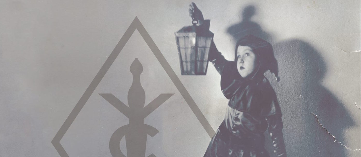
Coincidentally, the Crass symbol’s designer, David King, lives in San Francisco. King attended Ignorant’s gig and cheerily calls the protestors “keepers of the punk flame.” Indeed, for politicized punks today more likely pen lyrics inspired by critical theory than swilling beer; Crass created a model, and all of the band’s significance is bound up in King’s design. Next to the Black Flag bars, it’s probably the most common punk tattoo. The emblem features elements of the Christian cross and Union Jack, with a double-headed serpent (since the heads will not actually meet in the design, King rejects the description “Ouroboros”) negating the symbols of power.
Of course, the English-born artist’s relationship to his design and its legacy is more complex than the punks donning it today. King didn’t even mean for it to symbolize a band – the emblem actually predates Crass – but he’s necessarily a party to the band’s influential cult profile and ensuing debates. This, despite the fact that the emblem is a curiosity in the greater catalog of his visual art. In a way, fans and opportunists took the symbol away from King. He moved along, too, but since 2011 King has strove to reclaim his creation, and even update it.
Poised with his legs crossed on a San Francisco café patio with a seltzer water and shot of espresso, King wears a floral shirt, and colorful socks peek out from beneath a pant leg. He looks like an eccentric nobleman lounging incognito. When passersby boisterously shout, he pauses to watch and listen. King expresses complete ideas and frets over grammatical points. He meets every film reference with three more. He swings from nuanced analysis of English class politics to praising obscure American no wave bands. Before coffee, we met down the street at the DIY goods and publications store Needles & Pens, which features an exhibit of his visual art and retooled versions of the Crass symbol. Our conversation begins and ends there, but spans national borders, decades, and class divisions in between.
King was born in England in 1948. Razed buildings still sat in rubble from World War II, and food rationings were implemented throughout the country. It was dire. According to King, “Everyone wore dark blue, dark grey, or black. You might have one suit and a dark raincoat. It seemed like the sky was always grey as well. If you took a scan across the streets, everything was grey.” As a young child in the 1950s, King gravitated towards the colorful commercial designs peppering an otherwise bleak environment.
“The only point of color would be the corner store with its big enamel signs advertising cigarettes or soft drinks. There would be beautiful greens and blues for cigarettes. For soda, oranges, reds, and yellows. And then the jars of sweets had bright artificial colors. The comic books and paperbacks were riots of color that were all clearly commercial. They were these beacons of color.”
Enamored with the fantasy and brilliance of these few bright and busy visual oases, King resolved to be an artist, but puzzled the public school system with such ambition. As he remembers, “I went to the career officer in high school and someone said, ‘Oh I don’t think there are any jobs for artists, but I have this pamphlet,’ and… he rifled through his things and said, ‘Oh, here, this says commercial art. Maybe that’s art you can get paid for.’”
The heady design sensibilities of 1960s England were more to his liking. “Suddenly people were wearing floral ties and pink jackets, there was mod fashion, and then there was commercial TV, which had much better graphics,” King says. He met Penny Rimbaud and Gee Vaucher in art school in 1964. Then known as Jeremy John Ratter, Rimbaud later founded Crass, in which he played drums, wrote lyrics, and oversaw the independent record label of the same name. Vaucher, whose collage and gouache artwork adorns the covers of Crass albums and releases on Crass Records, lives with Rimbaud at Dial House to this day.
In 1977, punk graphics rejected the psychedelic ’60s palette of King’s preference. Flyers, fanzines, and album covers reverted back to stark blacks and greys. The new counter-cultural aesthetic sought to mimic and protest increasingly grim socioeconomic conditions. Margaret Thatcher led England’s Conservative Party in 1975 and became Prime Minister in 1979. As King details the prevailing attitudes of national leadership, “Society shifted to the right. Ronald Reagan was [Thatcher’s] god. Society shouldn’t take care of you, and socialism was a dirty word. Unions were the enemy and had to be destroyed. Unemployment went up and up.” He continues, “[Punk] was a grassroots movement that sprung from desperation, being thought of as worthless and not having a voice.”
At Dial House in 1977, before the founding of Crass, King witnessed an impassioned rant against the state’s administration of Christian values from Rimbaud. King encouraged him to write it down. Rimbaud obliged and titled the screed “Christ’s Reality Asylum.” The piece morphed into “Reality Asylum”, Crass’ first single, which also bore the symbol, thus representing a band forever. Rimbaud printed it as a 10-page pamphlet and asked King to design a logo for the cover. In an interview with The Quietus, Rimbaud remembers asking King to design something expressing the “Fascism of the church, fascism of the state, [and] fascism of the family.”
King doesn’t remember that specifically, but says, “That’s a pretty good summary of that moment. The idea of ‘Christ’s Reality Asylum’ was that we felt oppressed by the church [because] it was an arm of government. It was in your high school education. You had compulsory classes called ‘Religious Instruction,’ which meant you had to sit in a class with some sort of ex-vicar or priest moonlighting as a teacher going on about how Christ is here to save us. It was indoctrination.” So, he says, “I think the symbol is very simple. [It’s] against monolithic religious and cultural oppression.”
I first heard the recording of “Reality Asylum” on the Crass singles collection in my early teens. Muttered prayers fade into a haunting score as Crass co-vocalist Eve Libertine dramatically narrates the iconoclasm. I skipped the track – too creepy. I preferred the anarcho-pacifist ism-dismantling of “Bloody Revolutions” and thuggish urgency of “Banned from the Roxy”. Later I understood it in a social context, but it’s a cathartic purge of institutionalized religious bias from a decidedly English perspective. In other words, difficult for a suburban American teen to readily appreciate. U.S. public schools generally toe the line when it comes to separation of church and state, at least ostensibly, while the Church of England and the Queen go hand in hand.
Of course, for Rimbaud and Vaucher, Crass was only one project in the communards’ provocative lifespans. Following a screening of Gee Vaucher’s recent film “Angel” and dramatic poetry recital from Rimbaud earlier this year in San Francisco, Bay Area writer and publisher V. Vale moderated a rocky discussion with the two. Seemingly without prepared questions, Vale fumbled an interview recovery. “Well, let’s talk about Crass,” he sputtered. Flustered, Vaucher and Rimbaud met the prompt with annoyed outbursts.
King’s work continued long after Crass as well, in the fields of music, design, photography, and mixed-media, both in commercial and fine art contexts. In 1977, he moved to New York City. He praises no wave bands James Chance & the Contortions, Mars, and Three Teens Kill Four, who he saw at art spaces like The Kitchen. King continued to pursue visual art there, swapping the nascent English punk scene with Manhattan’s downtown experimentalism for inspiration. King’s band, first known as Arsenal (with avant-garde composer Rhys Chatham), appeared on Crass Records’ compilation. In 1982, the band moved to San Francisco and changed their moniker to Sleeping Dogs, whose “Beware” single appeared on the Crass imprint the same year. He’s lived and worked as a graphic designer in the city since. The local record label Broken Rekids sports a logo of his creation, and earlier this year the Museum of Contemporary Art featured him and Gee Vaucher in a mini-documentary entitled The Art of Punk.
“I’m sort of obsessed with Ebay,” he says, standing before his exhibit at Needles & Pens. (In September, the show travels to And Pens, Needles & Pens’ sister location in Los Angeles.) Some photographs depict amorphous-looking toys and objects in harsh lighting culled from the auction website. King is interested in how childhood memories can be found and substantiated online. Similarly, a photograph of a plastic Mr. Potato Head is mounted nearby. He smiles and remembers decorating actual potatoes as a child in England. It’s called “Doubt”. Childhood is a theme of King’s show, especially symbols of its surface pleasantness obscuring uglier truths. He brandishes a self-published book entitled, Male Men, which compiles stills from a televised English puppet show. Each puppet is an archetypal male. Frames frozen and resting on a page, the traditional figures of masculinity look absurd. The show also explores the inadequacies of cultural translation. King notes that pedestrian profiles on traffic signs in America are totally featureless and dull, but more animated in England. So, King embellished an American one with guns and knives and then shot a photo. He coolly wonders whether American motorists would be more careful if they perceived pedestrians as armed and dangerous. Though the exhibit’s palette is a dreamy wash of pastel tones overall, menacing peculiarities slowly come to the fore. King’s alternate versions of the Crass symbol cover the far wall. Side by side with his toys and ethereal photographs, the contrast is stark.













































New Comments